AURELUNE Guide
Building a Crystal Color Story
Hue, value, and texture are simple design tools for making gemstone jewelry feel personal, balanced, and easy to wear.
Editor's Note
A practical way to design a personal crystal jewelry palette by balancing hue, lightness, saturation, surface texture, and the quiet visual rhythm of everyday wear.
01 / Start with a mood
A palette is a feeling with a structure
The most memorable crystal jewelry combinations rarely come from using every beautiful stone at once. They begin with a mood: misty morning, sun-warmed garden, candlelit study, or clear water after rain. Once that mood is clear, choose a dominant color family and let the other materials support it.
This approach keeps gemstone meaning personal and symbolic. Rose quartz may remind one wearer of tenderness, while aquamarine may suggest open air or calm water to another. The design does not need to promise a result. It only needs to give the wearer a visual cue they are happy to carry. For a broader reference point, browse AURELUNE's [Gemstone Meanings guide](https://www.aurelunegems.com/guides/gemstone-meanings) and treat the language as tradition and personal interpretation rather than a guarantee.
02 / Choose the family
Let one hue lead, then invite a neighbor
Begin with the color you want people to notice first: soft pink, sea blue, moss green, smoky gray, warm amber, or violet. Add a neighboring hue when you want the palette to feel fluid, such as rose quartz with aquamarine or green fluorite with a cool white accent.
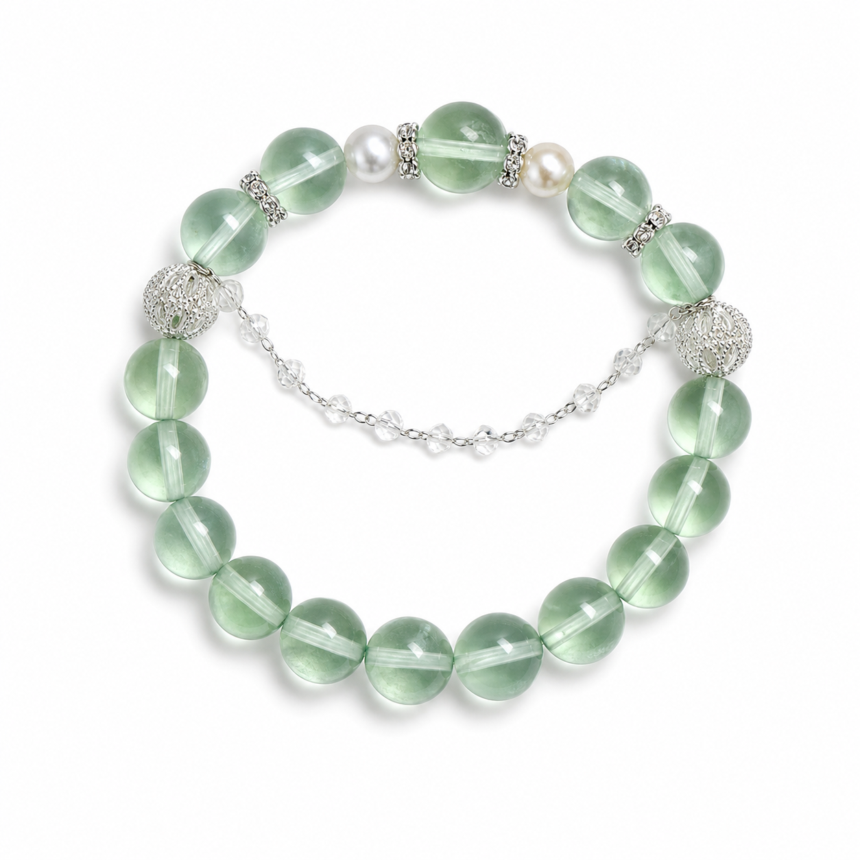
The Green Fluorite Pearl Bracelet is a useful example of this quieter relationship. Green remains the visual lead, while the pearl-like accent lightens the composition. When you are building a custom look, keep the strongest color near the center of the bracelet or use it as the one repeated note across a bracelet and pendant. See the existing piece at https://www.aurelunegems.com/products/crystal-bracelets.
03 / Check the lightness
Value creates the quiet architecture
Hue tells you whether a color reads green or blue; value asks whether it reads light or dark. Two stones can be different hues but similar in value, creating a soft, blended bracelet. A dark stone beside a pale stone creates sharper definition, even when the colors are not opposites.
Before you add another material, photograph the pieces in natural light or look at them from a short distance. If every bead sits at the same lightness, introduce a small darker spacer or a translucent stone. If the result feels busy, remove the darkest note first. This is a visual edit, not a rule about which crystal is more powerful.
04 / Tune the intensity
Use saturation like punctuation
A color can be vivid or muted even when its hue stays the same. In design terms, this intensity is often discussed as chroma or saturation. One bright accent can make a pale palette feel alive; several equally bright accents can make it difficult to see a focal point.
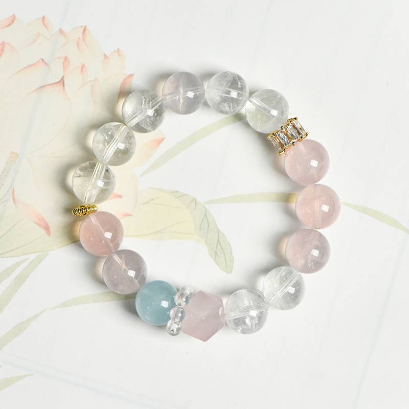
Try an 80/15/5 rhythm: about eighty percent of the visual impression comes from a quiet base, fifteen percent from a supporting color, and five percent from a small accent. The numbers are a helpful editing prompt, not a measurement. A Rose Quartz Clear Quartz Aquamarine Bracelet already demonstrates how a gentle pink, transparent white, and watery blue can share attention without competing. Explore it at https://www.aurelunegems.com/products/rose-quartz-clear-quartz-aquamarine-bracelet.
05 / Add tactile contrast
Texture keeps a restrained palette from going flat
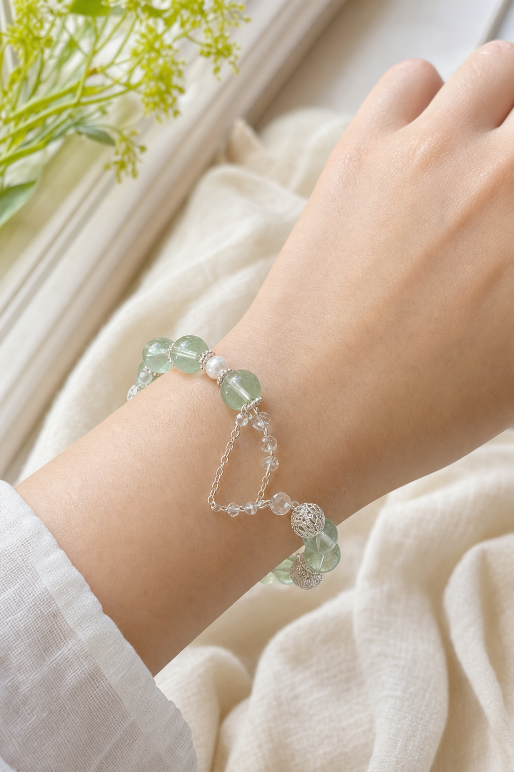
When the colors are close, surface becomes the storyteller. A polished bead reflects a pinpoint of light. A matte bead absorbs it. A pearl-like surface glows softly, while faceting breaks one color into small flashes. Hand-shaped wire adds an outline that can make a pale stone easier to read.
Choose one tactile contrast at a time. Pair a smooth bracelet with a delicate wire-wrapped pendant, or let a luminous accent sit beside a translucent bead. AURELUNE's wire-wrapped and crystal decor pieces can be explored through the public guides and product collection, but keep the final combination edited enough that each material has room to breathe.
06 / Extend the story
Repeat a color between the body and the room
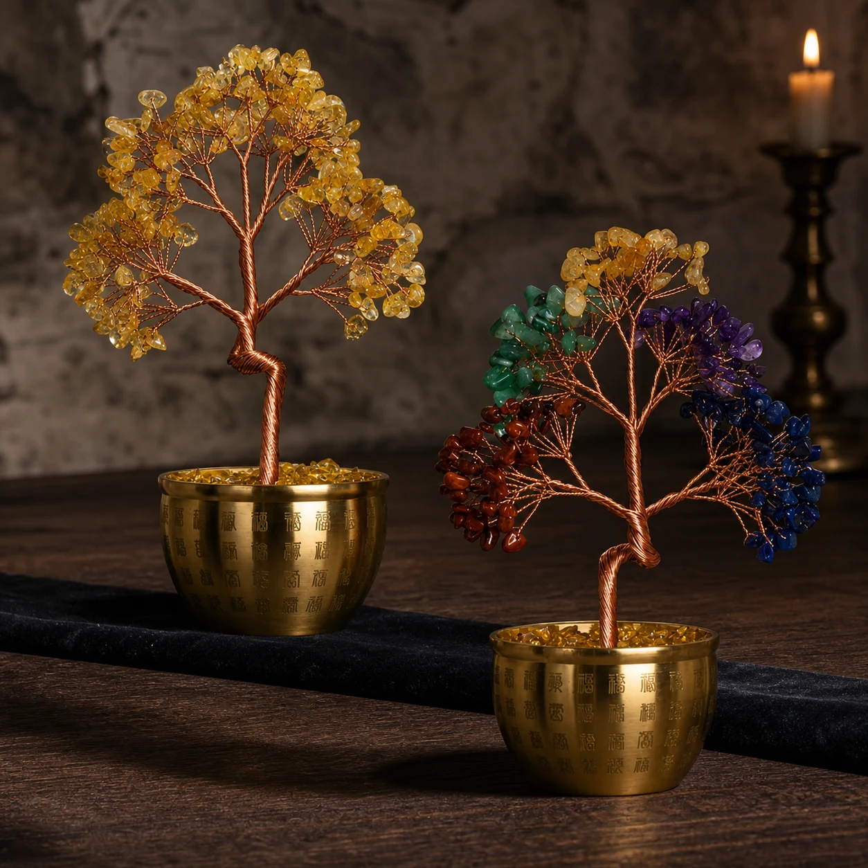
A jewelry palette can continue into a bedside tray, desk corner, or gift wrapping without becoming a themed display. Repeat one color rather than every color. For example, a cool green bracelet might meet a small crystal tree with a muted green or golden note, while the surrounding surface stays dark and quiet.
The Hundred Blessings Crystal Tree is a natural home accent for this kind of visual echo. It adds height and a different silhouette, so the bracelet remains the wearable focus. See the current product at https://www.aurelunegems.com/products/black-gold-super-seven-amber-nanhong-silver-bracelet.
A five-minute color story exercise
- 1Place three to five stones or jewelry pieces on a plain surface and name the mood you want the group to carry.
- 2Choose one anchor hue and remove anything that competes with it before adding more pieces.
- 3Compare the lightest and darkest elements, then adjust the value contrast until the group is easy to read.
- 4Add one texture contrast, such as pearl-like glow, matte surface, faceting, or a wire detail.
- 5Take a daylight photograph and choose the version you would genuinely wear or keep in view tomorrow.
A crystal color story is not about matching everything. It is about giving every color a reason to stay.
07 / Make it yours
Design for repetition, not just the photograph
The strongest palette is the one that survives real life: a sweater sleeve, a work desk, a small dinner, a quiet weekend. Keep notes on the combinations you reach for and the ones you admire but never wear. Over time, that record becomes a personal design language.
For a more hands-on starting point, the AURELUNE Chakra Crystal Grid DIY Set can turn color selection into a tactile arrangement before you commit to a jewelry combination: https://www.aurelunegems.com/products/chakra-crystal-grid-diy-set. The same principles apply whether the final piece is a bracelet, pendant, crystal sphere display, or a small gift set.
Crystal jewelry color palette guide
Build a personal gemstone jewelry palette with hue, value, chroma, texture, and practical editing. Use these ideas to style crystal bracelets, handmade pendants, crystal decor, and meaningful gifts without treating symbolism as a promise.
AURELUNE Studio
Ready to personalize the fit?
Open the DIY builder to choose stones, preview spacing, and save a bracelet around your wrist size.