
AURELUNE Guide
Gold, Silver, or Rose? How to Choose a Metal Tone for Your Crystal Bracelet
A practical styling guide to pairing crystal bracelets with gold, silver, and rose-toned jewelry through color, contrast, texture, and personal style.
Editor's Note
A practical styling guide to pairing crystal bracelets with gold, silver, and rose-toned jewelry through color, contrast, texture, and personal style.
01 / START WITH WHAT YOU WEAR
The easiest metal tone is already in your wardrobe
Choosing a bracelet metal tone does not need to begin with a rule about skin tone or a rigid color season. Begin with the jewelry and hardware you already reach for: a watch, a favorite ring, a belt buckle, or the small details on your everyday bag. Repeating that temperature once more at the wrist makes a new crystal bracelet feel considered from the first wear.
Silver and other cool-toned finishes tend to sharpen pale blue, green, clear, and smoky stones. Yellow or warm gold-toned finishes bring out honey, amber, brown, cream, and sunlit neutrals. Rose-toned metal sits between the two, adding a soft blush that can make pink, peach, lilac, and water-blue stones feel especially gentle.
This is a styling shortcut, not a restriction. The most personal combinations often come from a deliberate contrast. A cool bracelet against a warm watch can look more collected when one small detail repeats the transition elsewhere.
02 / COOL CONTRAST
Let silver-toned details make color feel crisp
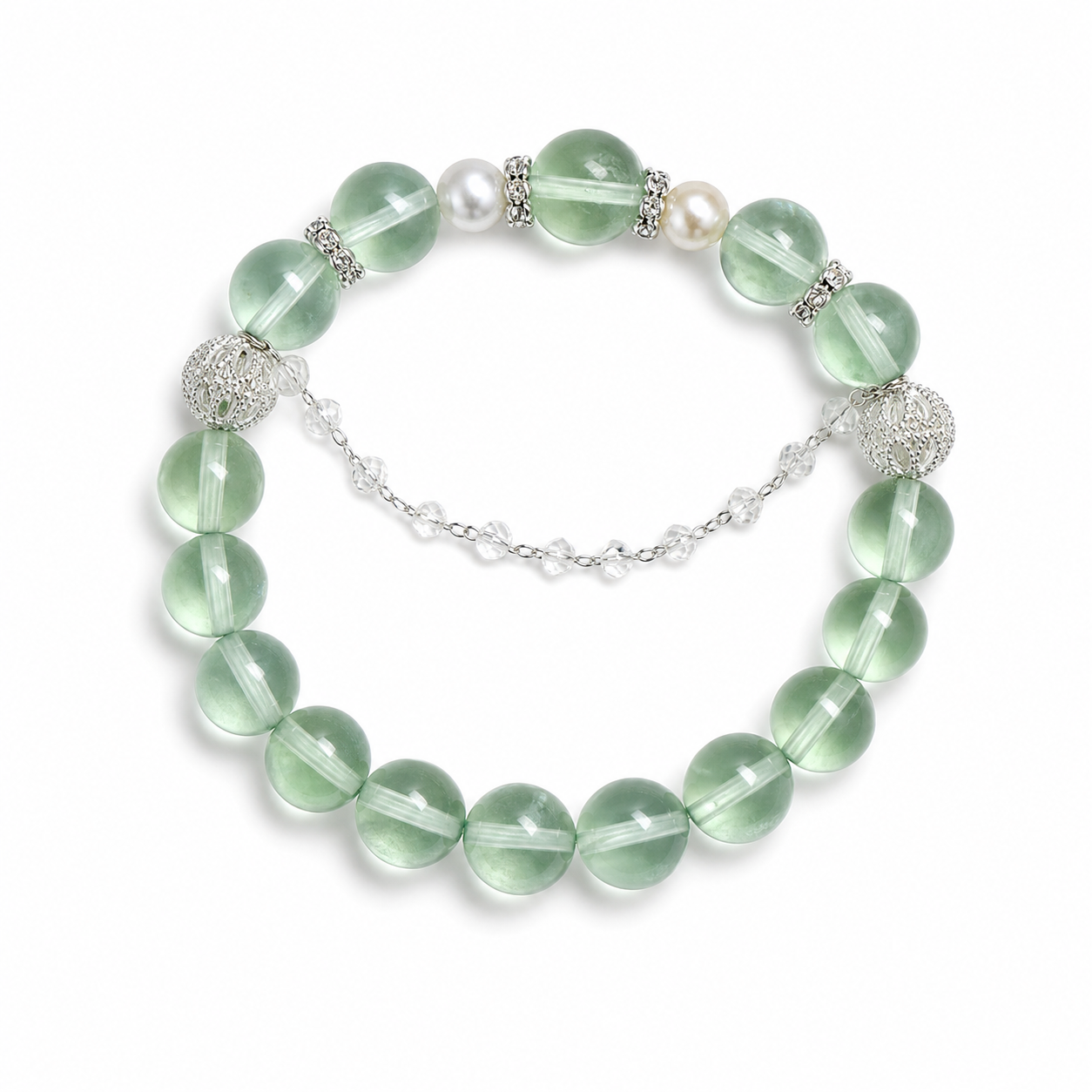
Cool metal tones are useful when you want a bracelet to feel clean, airy, or quietly modern. Green fluorite with pearl creates that kind of conversation: the green carries the color, the pearl softens the surface, and silver-tone accents keep the overall impression light.
Try this direction with white cotton, charcoal knitwear, denim, pale blue, or a simple black sleeve. Keep the rest of the wrist calm so the stones have room to be noticed. The Green Fluorite Pearl Bracelet is a natural starting point for this palette: https://www.aurelunegems.com/products/green-fluorite-pearl-bracelet
In a mixed-metal stack, use one cool-tone piece as the visual pause between warmer bracelets. Spacing matters more than perfect matching. A narrow gap or a small neutral bead can make different finishes feel intentional rather than accidental.
03 / WARMTH AND GLOW
Use warm metal color to echo the room and the outfit
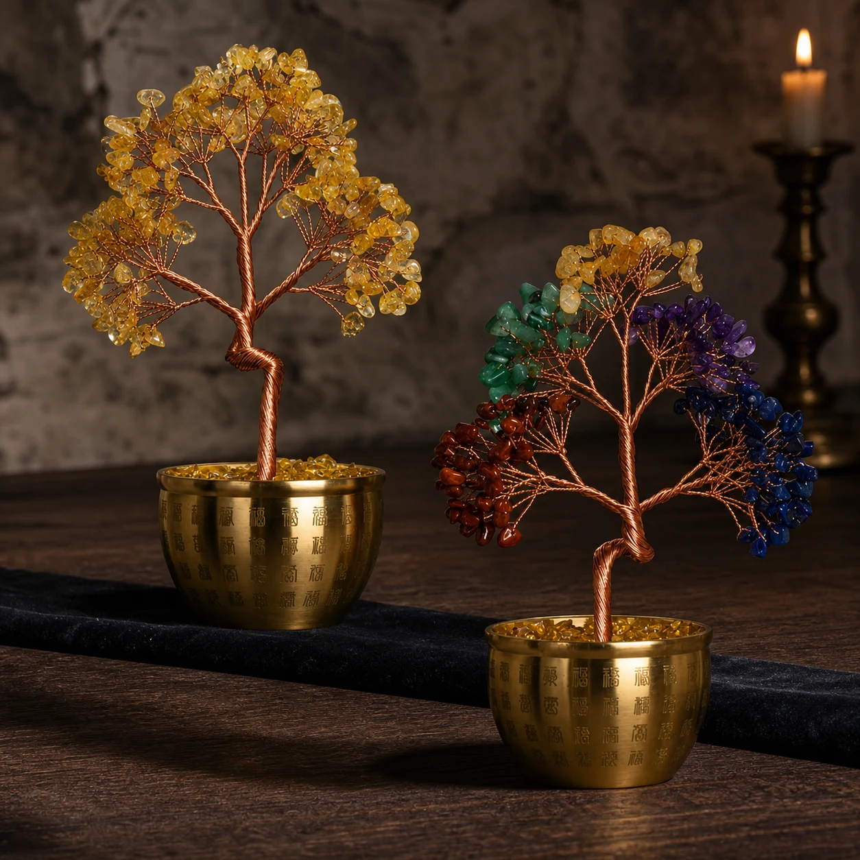
Warm gold and copper colors bring visual weight to a look. They pair naturally with cream, olive, rust, espresso, terracotta, and warm gray, but they can also make a striking frame for cooler stones when the contrast is repeated in a second detail such as a clasp, a ring, or a small pendant.
The principle is easy to see in decorative crystal work too. A copper-wire crystal tree in a gold Hundred Blessings vessel turns the metal into part of the story rather than a hidden support. If your jewelry has warm color, let it meet another warm surface nearby: a leather watch strap, a brass button, or a softly lit wood table. See the piece here: https://www.aurelunegems.com/products/black-gold-super-seven-amber-nanhong-silver-bracelet
Metal color is not the same as metal composition. For a factual background on why rose gold looks pink, the Gemological Institute of America explains that the color comes from alloying gold with copper and sometimes silver: https://4cs.gia.edu/en-us/blog/yellow-gold-vs-rose-gold/
04 / SOFT TRANSITIONS
Rose tones are a bridge, not a compromise
Rose-toned jewelry can connect a cool crystal palette to a warm wardrobe without making either side disappear. The effect is soft rather than neutral: pink, peach, clear, lilac, and pale blue stones pick up the rosy note, while cream and taupe keep it grounded.
A bracelet with rose quartz, clear quartz, and aquamarine already carries a gentle three-color story. Wear it alone when you want the stones to do the talking, or add a thin gold or silver line nearby and repeat that metal once in a ring. The Rose Quartz Clear Quartz Aquamarine Bracelet is designed for this kind of everyday color layering: https://www.aurelunegems.com/products/rose-quartz-clear-quartz-aquamarine-bracelet
The same idea works for gifting. Instead of guessing which metal someone is supposed to wear, notice the colors they live with. A blush-toned scarf, a silver watch, or a collection of warm rings can tell you more than a general rule.
A good metal tone does not compete with the stone. It gives the stone a place to belong.
A four-step test before you choose
- 1Name the dominant colors in your usual wardrobe and identify whether your everyday hardware leans cool, warm, or mixed.
- 2Choose one crystal color you already enjoy, then test it beside two metal tones in natural daylight rather than only under a shop light.
- 3Add one texture contrast: pearl against metal, polished stone against a matte finish, or a delicate bracelet beside a more sculptural piece.
- 4Wear the combination for an ordinary hour. Comfort, movement, and whether you reach for it again matter more than a perfect color chart.
05 / MAKE IT PERSONAL
Build a small palette before you build a stack
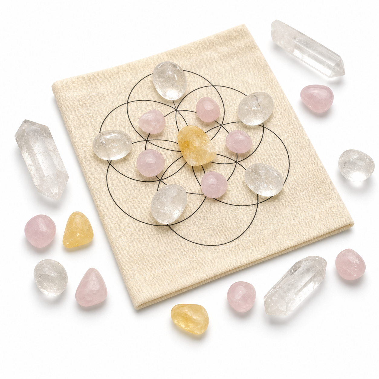
If you are designing a custom piece or choosing a meaningful gift, make a tiny palette first. Place a photo of the outfit, one metal reference, and two or three stone colors together. A crystal grid or DIY set can become a visual planning surface, helping you see whether the final combination feels quiet, luminous, earthy, or deliberately high contrast.
The AURELUNE Chakra Crystal Grid DIY Set is one possible starting point for that kind of hands-on color study: https://www.aurelunegems.com/products/chakra-crystal-grid-diy-set
When the palette feels right, choose one hero color and let the other materials support it. That is usually more elegant than giving every stone and metal equal volume.
A QUIET FINISH
Wear the combination until it becomes yours
Metal tone is a useful design tool, but the final test is lived experience. Notice which bracelet works with your morning clothes, which one feels comfortable beside your watch, and which colors still make sense when the light changes. Personal style is built through those small repeat decisions.
For more practical guidance, browse the AURELUNE Gemstone Guide for gemstone meanings and the Bracelet Care Guide for everyday maintenance: https://www.aurelunegems.com/guides/gemstone-meanings and https://www.aurelunegems.com/guides/bracelet-care-guide
Crystal bracelet styling, made personal
Learn how to choose gold, silver, or rose-toned jewelry for crystal bracelets using wardrobe color, contrast, texture, comfort, and personal symbolism.
AURELUNE Studio
Ready to personalize the fit?
Open the DIY builder to choose stones, preview spacing, and save a bracelet around your wrist size.